
I think in this case, the data really speaks for itself, so lets get on the wayback machine and head into the data of the past...

This graph shows the price of gold since 1973. Note the spike in 1980.. I'm not quite sure what caused it, but it might have been the arab Israeli war..

This is the graph since 1983. Notice how the data is more or less flat until 2002?
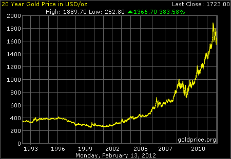
20 Year Chart this time, which shows again the flatness of the gold price until 2002.

Now this chart is the real kicker, it basically shows that gold has increased in value from $300 to $1721 in 10 years, which is a return of 473% if my math is correct. Not a bad little earner, to say the least.. =)
There is much speculation that gold could hit $2000 an ounce. In my opinion, it is just a matter of when, not if. As long as the US dollar keeps being debased in such a massive manner, the value of gold denominated in dollars will continue to rise.
The fondness of today's central banks for Quantitative Easing, which is just printing money in another way, and hence a tax on everyone, since as the currency is devalued, the real savings of the entire country are diminished.
It is estimated by shadowstats.com that the real rate of US inflation at the moment is 10.8% CPI. This is getting dangerously close to hyperinflation, because it means that if you keep cash under your pillow for 10 years, it will be essentially worthless. However, I am sure the US has a plan to invade thier way out of it... Perhaps by stealing Iran's gold reserves, which are very large for a country it's size, not to mention the Iranian Crown Jewels, which are literally priceless.


The Darya-I-Noor Diamond An Emerald Necklace.
As we get closer to today with the charts, we see more noise begin to creep in.

You can clearly see the 2011 bubble and crash in this one, but is more clear as we move to the 2 Year
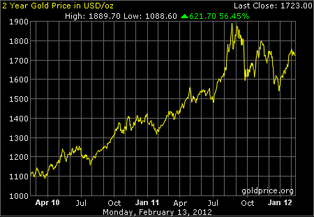
Here, the bubble and the crash of August 2011 is much more clearly visible.

And here we are, this is pretty much the best chart for showing the effects of the flash crash. at it's height in August 2011, gold hit a record US$1900 an ounce, then within a month, fell to under US$1600. However, by November that same year, boosted by bank bailouts and QE, it was back at US$1800.
Where gold will go from here is anyone guess really, but in my opinion, it cannot but jeep going up at the moment.. there is so much inflationary pressure on the USD and so much uncertainty in the market that gold will continue to be not only a safe place to store your money, but an investment that at the moment anyway, is likely to give you a much better return than a bank account.
Christopher Carrion
No comments:
Post a Comment